
You run a query. You get rows. Now you need a chart for a standup or a Slack thread. Usually that means exporting to a spreadsheet.
DBCode skips that step. Run a query, chart the results, all in VS Code.
The fast way
Run your query. Click the Chart icon in the results toolbar (or press Ctrl+G / Cmd+G). A chart appears using your last-used chart type. First time defaults to grouped column.
Click the dropdown arrow next to the Chart icon to pick a different type.
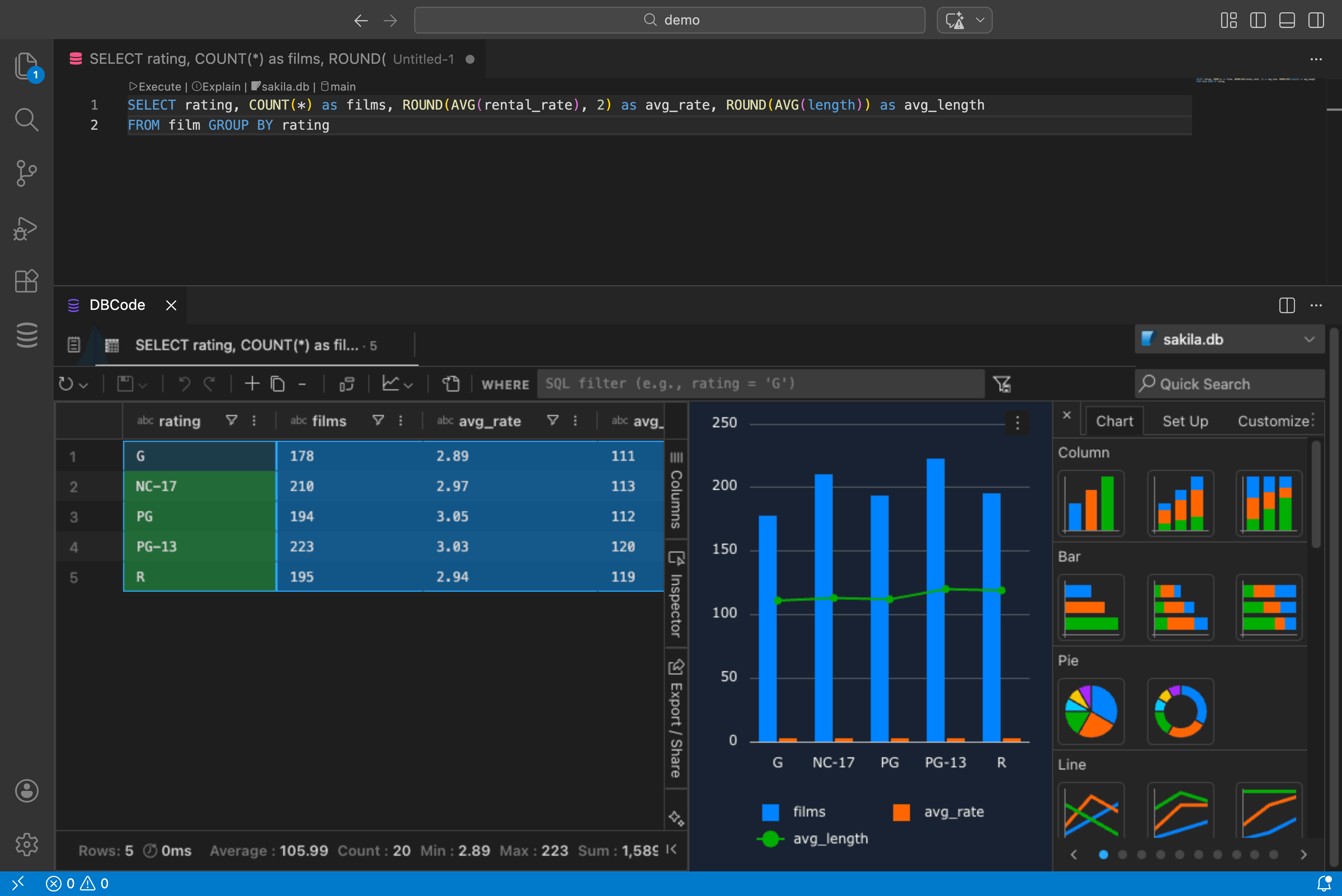
Chart types
Column, bar, line, area, pie, donut, scatter, bubble, radar, treemap, sunburst, heatmap, waterfall, funnel, histogram, box plot. Plus combination charts that mix column and line in one view.
Click the three-dot menu on any chart and select Edit to configure categories, series, aggregation, titles, legends, and axis labels across the Chart, Set Up, and Customize tabs.
Charting from a selection
Don’t want to chart the whole result set? Highlight specific columns or rows in the results grid, right-click, and choose Chart Range with your preferred chart type.
Pivot mode
For multi-series data, toggle Pivot Mode in the Columns tab. Drag columns into Row Groups, Column Labels, and Values. Then right-click and choose Pivot Chart.
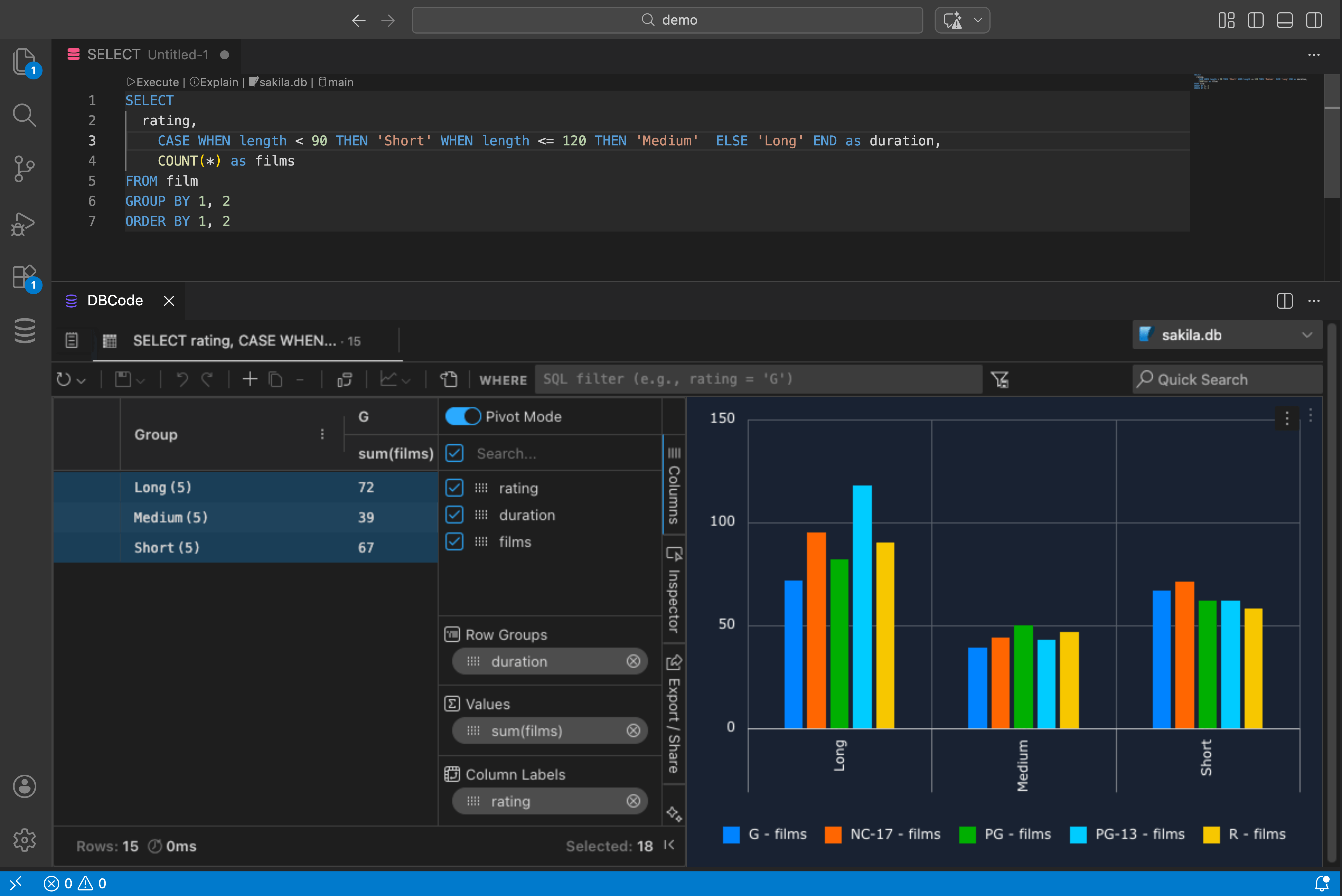
This is useful when your data is in long format (one row per category per date) and you want each category as a separate series.
Filters update charts
Apply filters in the Filters tab of the results pane and charts update automatically. Text filters (contains, starts with), number filters (greater than, between), date filters (before, after). The chart reflects whatever the grid shows.
Download
Click the three-dot menu on a chart and select Download to save it as an image.