
Visualize
DBCode lets you create charts from any query results or table data. Charts work in both the SQL Editor and Notebooks - run a query or open a table, then use any of the methods below to visualize the results.
Chart Creation Methods
Section titled “Chart Creation Methods”Method 1: Using the Chart Toolbar Button
Section titled “Method 1: Using the Chart Toolbar Button”The fastest way to create a chart from your results:
-
Select Data
- Highlight desired columns or rows by clicking and dragging in the Results Pane
-
Create Chart
- Click the Chart icon in the toolbar (or press
Ctrl+G/Cmd+G) - A chart is created instantly using your last-used chart type (defaults to grouped column)
- Click the Chart icon in the toolbar (or press
-
Change Chart Type
- Click the dropdown arrow next to the chart icon to choose from all available chart types (Column, Bar, Pie, Line, Area, Scatter, Polar, Statistical, Hierarchical, Specialized, Funnel, and Combination)
- Your selection is remembered for next time
-
Edit Chart
- Click the ⋮ (three dots) menu in the top-right corner → Edit
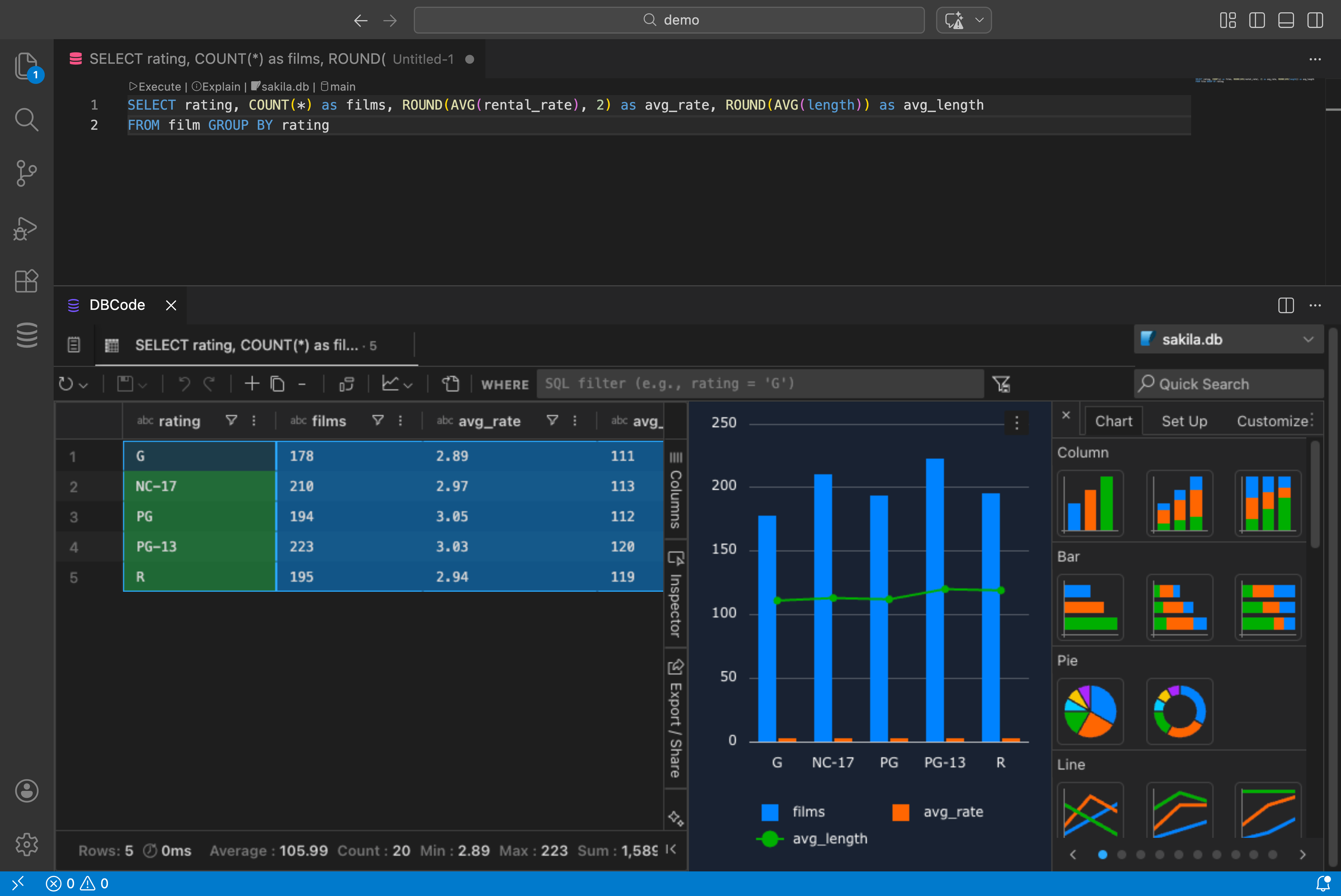
- Configure settings across these tabs:
- Chart: Change visualization type and style
- Set Up: Define categories, series, and aggregation methods
- Customize: Adjust styles, titles, legends, and axis labels
Method 2: Using Range Selection
Section titled “Method 2: Using Range Selection”-
Select Data
- Highlight desired columns or rows by clicking and dragging in the Results Pane
- Alternatively, use the
Columnstab to select columns and drag them toRow GroupsandValuesfields
-
Create Chart
- Right-click on selection → Chart Range → Select chart type (bar, line, pie, etc.)
-
Edit Chart
- Click the ⋮ (three dots) menu in the top-right corner → Edit → Use tabs to customize
Method 3: Using Pivot Mode
Section titled “Method 3: Using Pivot Mode”-
Enable Pivot Mode
- Toggle the Pivot Mode button in the
Columnstab of results pane
- Toggle the Pivot Mode button in the
-
Configure Pivot Layout
Section Purpose Example Row Groups Group data by categories Product Category, Region Values Display series with aggregation SUM(Sales), COUNT(Orders) Column Labels Group series across columns Year, Quarter 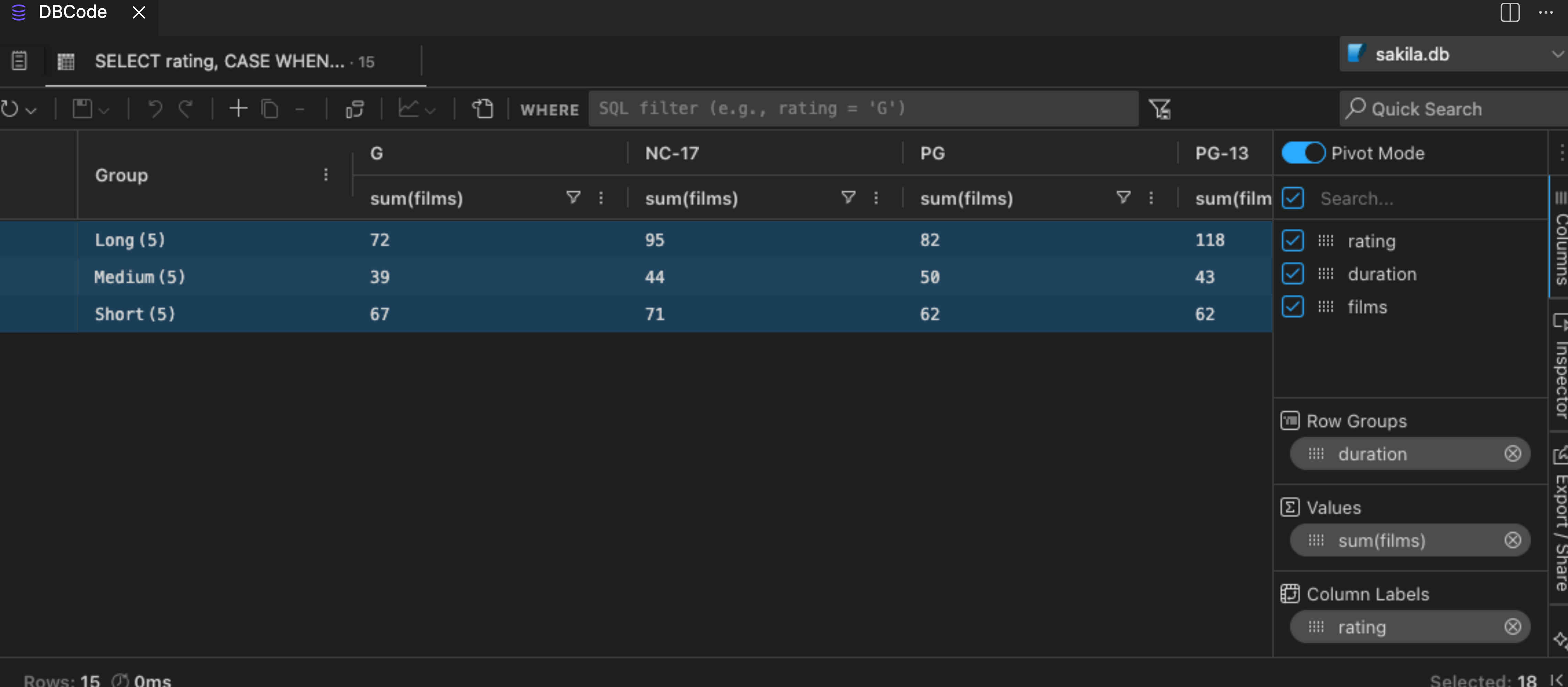
-
Create Chart
- Right-click in result area → Pivot Chart → Select chart type
-
Edit Chart
- Click ⋮ (three dots) menu → Edit → Use tabs to customize
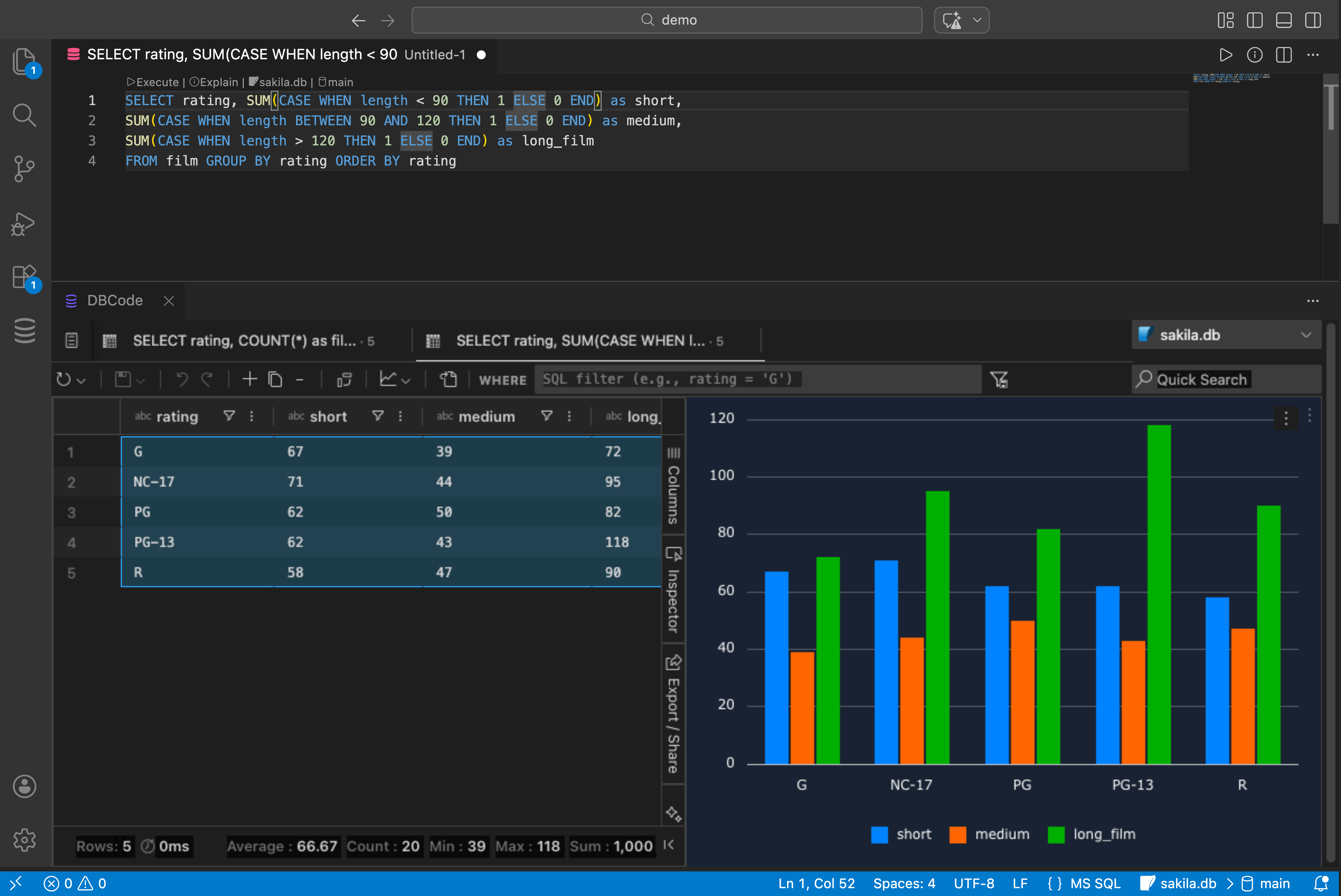
Charting Multi-Series Data
Section titled “Charting Multi-Series Data”A common scenario is charting data that has a category column (like a platform or region) alongside a date and a metric. For example:
SELECT date_trunc('week', date) AS week, platform, SUM(value) AS metricFROM eventsGROUP BY 1, 2ORDER BY 1, 2;This produces “long format” data where each row has a date, a category, and a value:
| week | platform | metric |
|---|---|---|
| 2025-12-29 | ABC | 143 |
| 2025-12-29 | EFG | 1127 |
| 2026-01-05 | ABC | 197 |
| 2026-01-05 | EFG | 1512 |
To chart this with each category as a separate colored series, you have two options:
Option 1: Reshape in SQL (Wide Format)
Section titled “Option 1: Reshape in SQL (Wide Format)”Rewrite the query so each category becomes its own column:
SELECT date_trunc('week', date) AS week, SUM(value) FILTER (WHERE platform = 'ABC') AS "ABC", SUM(value) FILTER (WHERE platform = 'EFG') AS "EFG"FROM eventsGROUP BY 1ORDER BY 1;Then select all columns and use Chart Range or the Chart toolbar button. Each numeric column automatically becomes a separate series.
Option 2: Use Pivot Mode
Section titled “Option 2: Use Pivot Mode”Keep the original long-format query and use pivot mode to reshape the data visually:
- Open the Columns tab and enable Pivot Mode
- Drag
weekinto Row Groups - Drag
platforminto Column Labels - Drag
metricinto Values (set aggregation to Sum) - Right-click the pivot grid and choose Pivot Chart to select a chart type
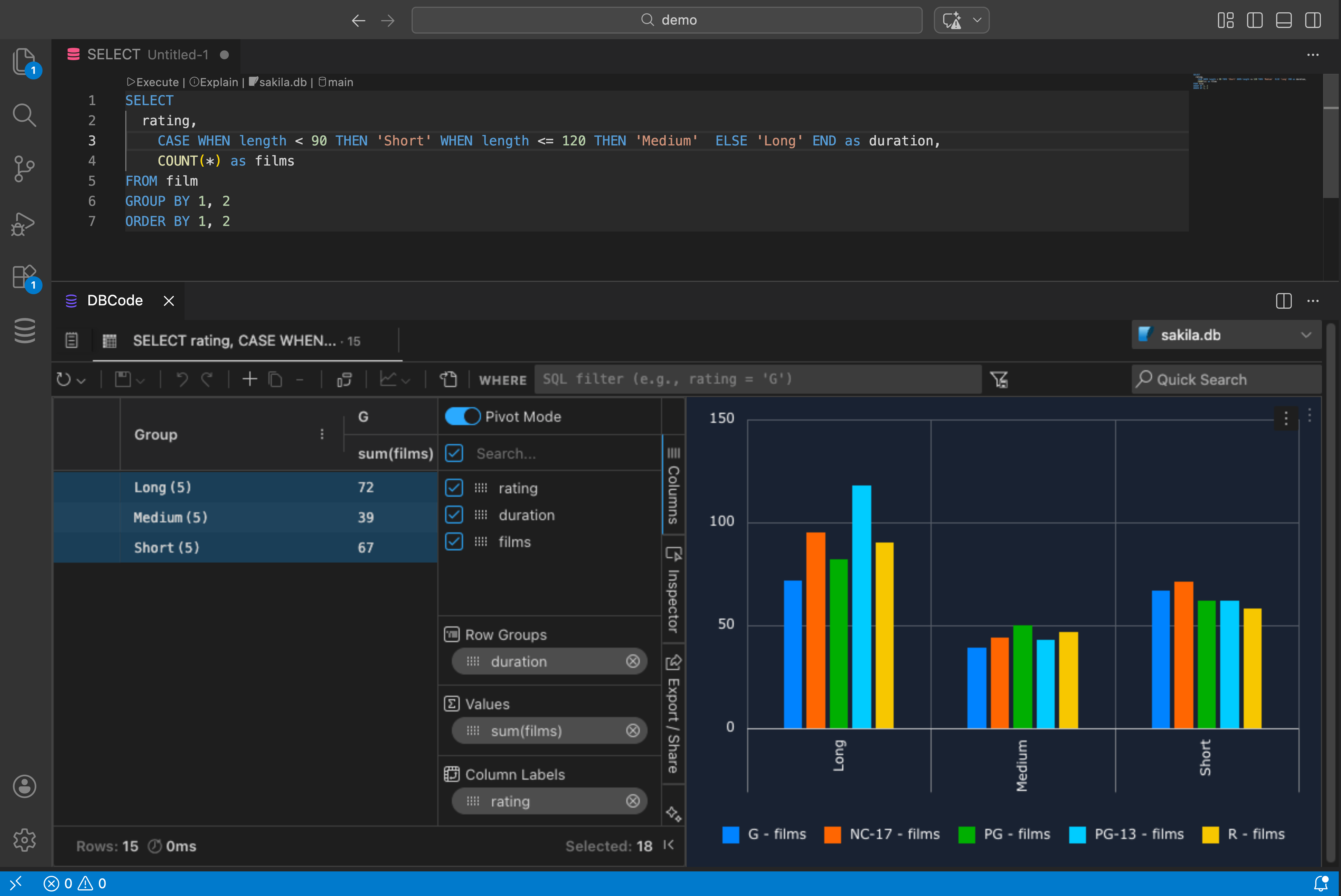
Chart Customization Options
Section titled “Chart Customization Options”Style and Appearance
Section titled “Style and Appearance”| Tab | Feature | Available Options |
|---|---|---|
| Chart Style | Visual treatment | Padding, background color |
| Titles | Text elements | Chart title, subtitle, axis titles |
| Legend | Reference guide | Enable/disable, position (top, bottom, left, right) |
| Series | Data appearance | Style, tooltips, opacity, labels, shadows |
| Axes | Grid structure | Position, color, grid lines, ticks, labels |
Supported Chart Types
Section titled “Supported Chart Types”- Column/Bar Charts: Compare data across categories (grouped, stacked, 100% stacked)
- Line Charts: Analyze trends over time (line, stacked, 100% stacked)
- Pie/Donut Charts: Display proportions of a whole
- Area Charts: Represent cumulative data trends (area, stacked, 100% stacked)
- X Y (Scatter) Charts: Highlight relationships between variables (scatter, bubble)
- Polar Charts: Radar line, radar area, nightingale, radial column, radial bar
- Statistical Charts: Box plot, histogram, range bar, range area
- Hierarchical Charts: Treemap and sunburst visualizations
- Specialized Charts: Heatmap and waterfall
- Funnel Charts: Funnel, cone funnel, and pyramid
- Combination Charts: Mix column & line or area & column in a single chart
Additional Features
Section titled “Additional Features”Chart Management
Section titled “Chart Management”- Expand: ⋮ menu → Expand (enlarges chart for better visibility)
- Shrink: ⋮ menu → Shrink (returns to original size)
- Close: ⋮ menu → Close (removes chart from view)
Data Filtering
Section titled “Data Filtering”- Click the Filters tab in query output pane
- Apply filters using operators:
- Text: Contains, Equals, Starts with, Ends with
- Numbers: Equals, Greater than, Less than, Between
- Dates: Before, After, Between
- General: Blank, Not blank
- Charts automatically update to reflect filtered data
Exporting Charts
Section titled “Exporting Charts”- Click ⋮ menu → Download
- Choose filename and location to save as image
Benefits of DBCode Visualization
Section titled “Benefits of DBCode Visualization”- Integrated Analysis: Complete data workflow within VS Code
- Flexible Visualization: Multiple chart types for different analysis needs
- Interactive Exploration: Drill down, filter, and refine visualizations
- Efficient Workflow: Toggle between table and chart views seamlessly
DBCode’s chart visualization transforms raw query outputs into actionable insights directly within Visual Studio Code.