Chart
DBCode empowers users to visualize query results with charts, enabling better insights and efficient analysis. With support for various chart types, such as bar charts, line charts, and pie charts, DBCode integrates visualization into your workflow seamlessly within Visual Studio Code.
Enabling Chart Visualization
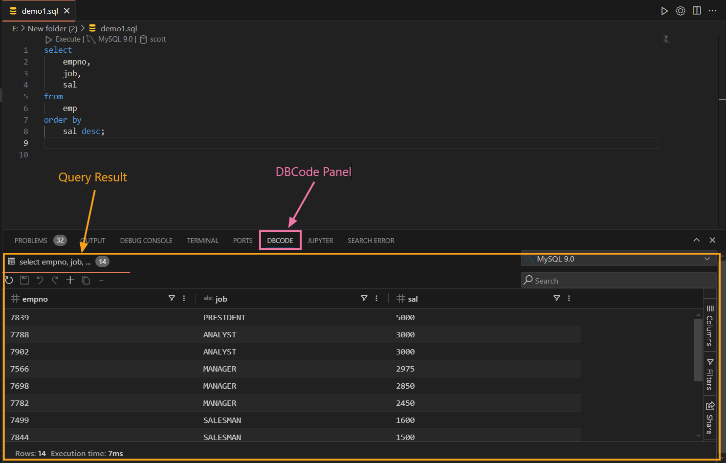
- Run a Query
-
Open a
.sqlfile in DBCode Notebook or SQL Editor and execute your SQL query. -
For detailed guidance, refer to SQL Editor Documentation and Notebooks Documentation.

- View Results
-
In the SQL Editor, results appear in the Results Pane at the bottom.
-
In DBCode Notebook, results are displayed in the output area of the respective code cell.

Creating a Chart
DBCode offers two methods to create charts:
Method 1: Using Range Selection
-
Select Data
- Highlight the desired Columns or Number of Rows in the Results Pane by clicking and dragging.

- Alternatively, you can select the desired columns from
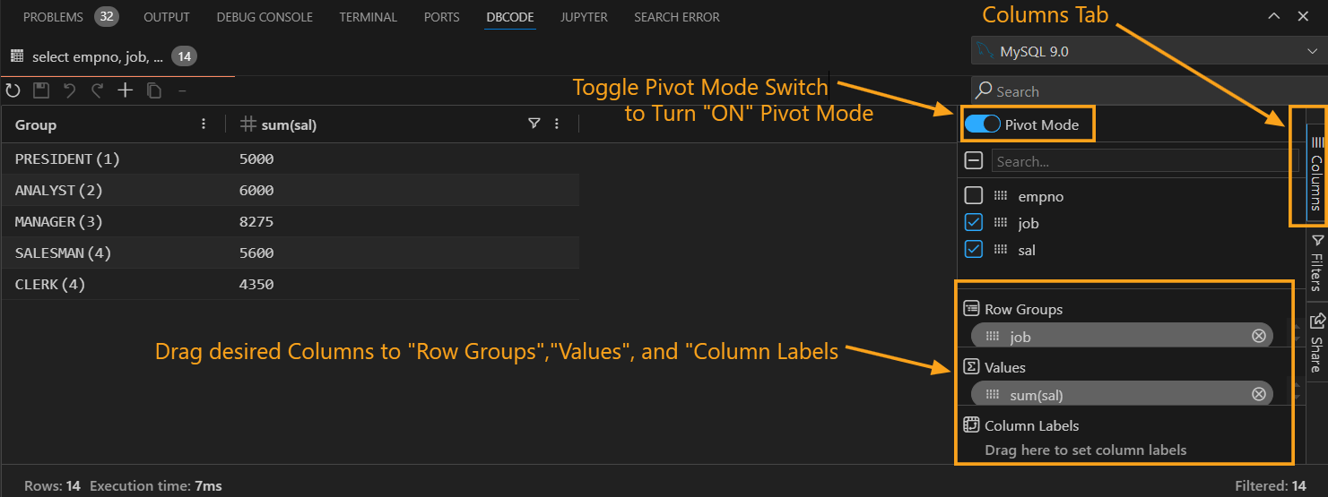
Columnstab and set theRow GroupsandValuesby dragging desired columns to that fields. Then proceed to createChart Range.
-
Create the Chart
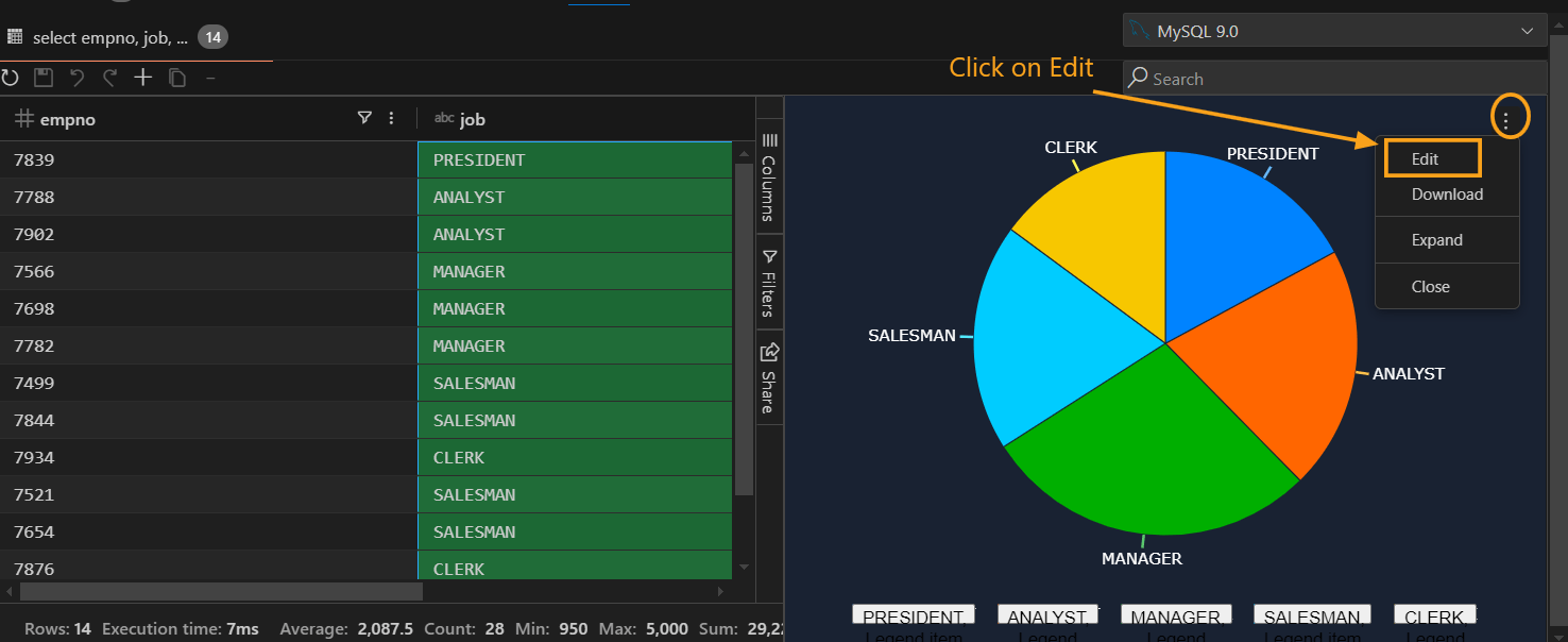
- Right-click on the selection, hover over Chart Range in the context menu, and select the chart type (e.g., bar chart, line chart, pie chart).

-
Edit the Chart
- Click on the three dots at the top-right corner of the chart and select Edit.

- Configure settings across the following tabs:
- Chart: Change the chart type and style.

- Set Up: Define categories, series, and aggregation types.

- Customize: Adjust styles, titles, legends, and axis labels.

Method 2: Using Pivot Mode
-
Enable Pivot Mode
- Toggle Pivot Mode in the
Columnstab of the output results pane.
- Toggle Pivot Mode in the
-
Drag and Drop Columns
- Row Groups: Add columns to group data by categories.
- Values: Add columns to display series; aggregate using functions like SUM, COUNT, AVG, MAX, etc.
- Column Labels: Use this to group series data across multiple columns for comparison.

-
Create the Chart
- Right-click in the output result, hover over Pivot Chart, and select the desired chart type.

-
Edit the Chart
- Access the Edit menu (three dots in the top-right corner) to refine the chart using tabs like Chart and Customize.

Chart Customization
Customize Tab Features
-
Chart Style
- Adjust padding and background color.
-
Titles
- Define the chart title, subtitle, and axis titles.
-
Legend
- Enable or disable legends and set their position.
-
Series
- Configure series styles, tooltips, opacity, labels, and shadows.
-
Horizontal Axis
- Set position, color, grid lines, ticks, and labels.
-
Vertical Axis
- Configure position, color, grid lines, ticks, and labels.
Supported Chart Types
- Column Chart
- Bar Chart: Compare data across categories.
- Line Chart: Analyze trends over time.
- Pie Chart: Display proportions of a whole.
- Scatter Plot: Highlight relationships between variables.
- Area Chart: Represent cumulative data trends.
- Hierarchical Chart: Represent data hierarchies with expandable categories for better visualization of parent-child relationships.
- Combination Chart: Combine multiple chart types (e.g., bar and line) to present complex data relationships in a single visualization.
Additional Features
Expanding or Shrinking Charts
-
Expand: Click the three dots in the chart’s top-right corner and select Expand.

-
Shrink: Repeat the process and select Shrink.

Using Filters
- Click on the Filters tab in the query output pane.

- Apply filters using criteria like Contains, Equals, Blank, etc.

- The filtered data will automatically update the chart view.
Exporting Charts
- Click the three dots in the chart’s top-right corner and select Download.

- Specify the file name and location to save the chart as an image.

Closing Charts
-
To remove a chart, click the three dots in its top-right corner and select Close.

Benefits of Chart Visualization
- Enhanced Insights: Easily detect patterns and trends.
- Integrated Workflow: Stay within Visual Studio Code for end-to-end analysis.
- Customizable Visuals: Tailor charts to meet specific needs.
- Efficiency: Toggle between table and chart views effortlessly.
DBCode’s chart visualization transforms raw query outputs into actionable insights, simplifying data analysis and enhancing workflows directly within Visual Studio Code.
